


Have you ever heard of grunge? If you are older then 25, your first thought was Kurt Cobain, right? Sure, he is the icon of grunge, but grunge is so much more than just that. Firstly in the mid 80′ it was a subgenre of alternative rock particularly in the Seattle area. As common, other arts evolved from music, it became a movement, fashion art, design, and more.

On todays Typography 101 we will focus on a particular part of grunge design, grunge typography.
This type of typography or aesthetic was defined by David Carson. He is an American graphic designer, art director and surfer. He is best known for his innovative magazine design and use of experimental typography. It was widely imitated.

This fonts are on the low at this moment, but it does not mean, that we can not use grunge typography in our designs. Because it is more realistic, robust, less ideal, showing us the real world in designs, it will always be useful.
Free grunge Typography
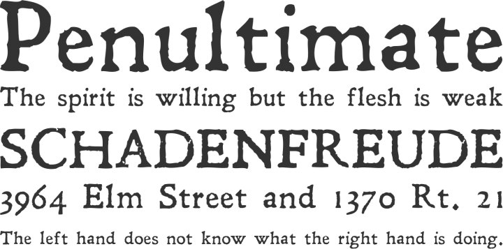
We prepared some examples of free Grunge typography.
DOWNCOME


LEANDER

DISTRICT


HEAVYWEIGHT


HVD POSTER


Grunge will always be what it is. You just have to learn its good and bad sides to use is wisely.

You must be logged in to post a comment.