


The field of design, especially in the fast-changing world of Internet, is a subject to constant change. Each design is a creation of a designer or a team of designers influenced mostly by their personal taste and creative abilities, however, there are some trends that graphic design as an industry generally follows.
New graphic design trends take over and slowly push out the old ones. Keep reading and discover some of the graphic designs we can expect to rise or keep rising in 2017. Some of them are new, some of them have been around for a while, but they all have one thing in common – we can expect to see them crawling at us from all sides in the near future.
Colour of the year: Greenery
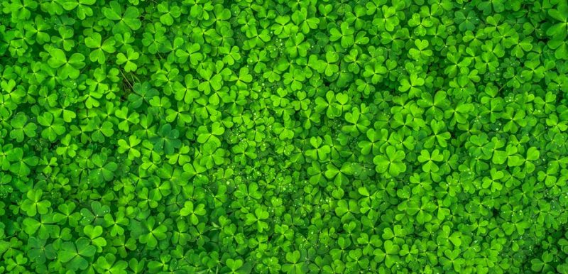
Before we get into styles of graphic design, we will first take a look at one thing that hugely affects it – color. One of the leading companies in color and design industry, Pantone, has announced that Greenery is the color of the year 2017. They believe that Greenery, with its refreshing and revitalizing shade, is symbolic for new beginnings.
“Greenery is a fresh and zesty yellow-green shade that evokes the first days of spring when nature’s greens revive, restore and renew.” If this color really catches on, we can expect it to be implemented in all aspects of graphic design and bring a little more nature into it.
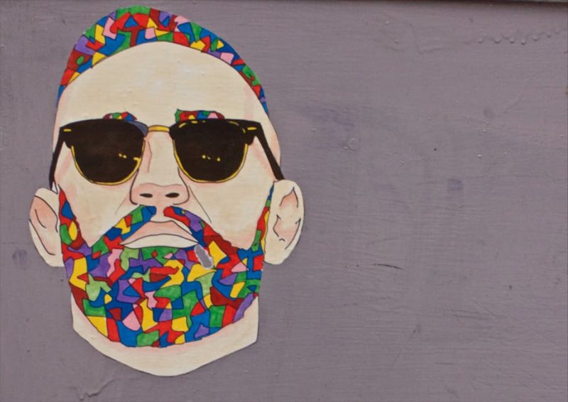
Brighter colors will take over the muted ones we are used to
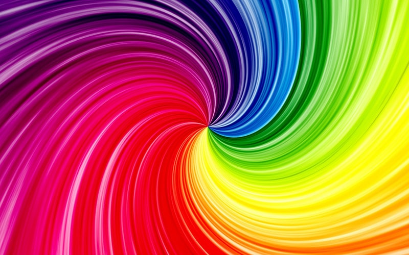
In the last few years, bright colors have practically disappeared. Most of the companies that influence graphic design ditched them, while muted and neutral colors have risen to the top. Now, graphic design professionals, as well as general population, have had enough of stale and boring colors. We might expect really bright and bold colors to rise in popularity in 2017.
Let’s hope that bright colors bring a fresh breath into all aspects of graphic design. If the aforementioned color of the year, Greenery, gets popular, it might be one of the bold colors we will keep seeing in 2017.
Material Design is still around and stronger than ever

Material Design is a great example of a trend in graphic design that has stuck around for some time and it is most likely not going anywhere. And there is a good reason for it.
Material Design is a design language developed by Google and announced in 2014. Google has been using it since and made it the main design style basically for the entire Android ecosystem. And, as we all know, a company with such a huge online presence as Google can definitely change the game in the design aspect of websites and mobile applications.
But Material Design has grown much larger that only a design style used for Google’s own services and applications. It has instantly become popular and thousands of websites and brands have implemented it since, both in online and offline aspects of their business. And don’t worry, Material Design is not going anywhere.
Modern Retro will keep getting more and more popular
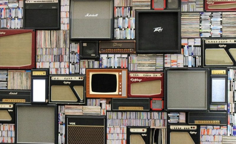
Modern Retro design language has also been around for quite some time. But that’s nothing unexpected for a design style that has the word “Retro” in its name. Styles keep shifting and old things are becoming new again.
Modern Retro comes with a little bit of nostalgia. It contains shapes, colors, and patterns that remind us about our childhoods. And we like it. But Modern Retro is not only about the old stuff. We can’t neglect the second part of its name. The word “Modern” symbolizes a new touch added to an old design style that has been used in the previous decades.
Generic images will get replaced by authentic photos
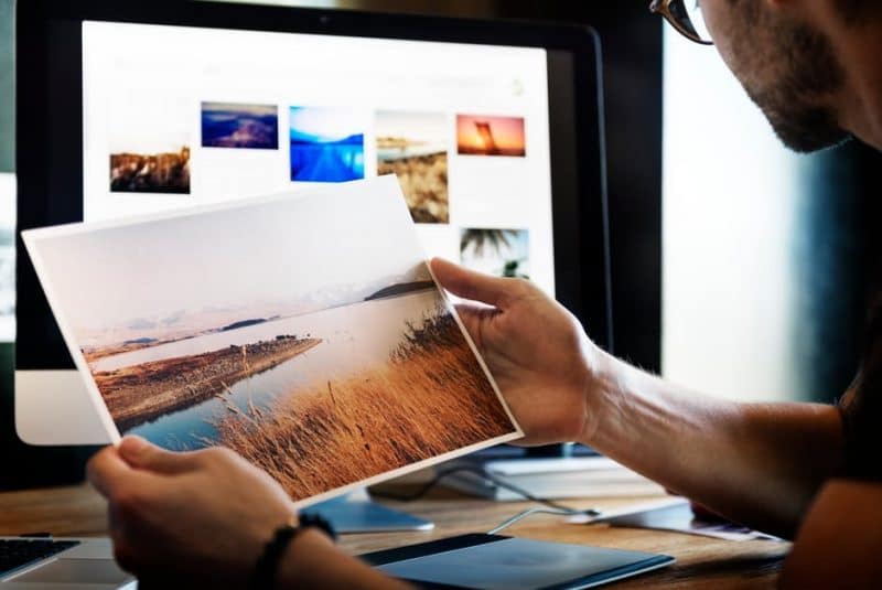
Pictures and photos are often used in graphic design. We are used to seeing professional pictures that capture people or objects in the best light possible. These pictures might be authentic but they often aren’t. Generic pictures are getting overused and brands will most likely start using their own authentic pictures.
But there is more to it than just generic pictures being overused. When you start using authentic pictures that really represent your brand, your customers will have an easier time connecting with your company. And that’s what you want, isn’t it?
Hand drawn graphics and illustrations
We will stay on the topic of connecting with people even with this trend. Hand drawn graphics will be slowly but surely replacing the “digital” ones. Hand drawn pictures can add a little more authenticity to your company image and can be also used to strengthen your brand awareness.
Hand drawn graphics might not seem professional and might look a bit childish, but there is nothing wrong with that. People will connect with your company more when you look real and not artificial. And what’s “more real” than hand drawn graphics? Don’t be afraid to appeal to the child that is hidden inside every single one of us.
Cinemagraphs – a crossover of still and moving images

Moving pictures tend to grab attention better than the still ones. Cinemagraphs are still images with only subtle motions. Small movements incorporated into a still picture create a very interesting contrast that instantly grabs people’s attention and drive their involvement.
Cinemagraphs were first created by photographers Kevin Burg and Jamie Beck in 2011 and has only been rising in popularity since. The use of cinemagraphs is expected to keep rising in 2017 and the following years.
ABOUT AUTHOR
Viktor from WebCreate.Me shared with us this article based on his research & experience with reviewing WP portfolio themes for creatives.

You must be logged in to post a comment.