


As a graphic designer, your creative aptitude is higher than most. But having a UI/UX job also implies that you have to work in close connection with the developers.
At times, they will look for options to make the interface more user-friendly, alter the color combination, etc.
If you’re wondering about all this hype with UI design, it’s simply because of its impact on prospects. Studies suggest that every 4 out of 5 visitors tend to leave the platform if there is a UI glitch, which is another reason to invest in the UI design of your application or website.
You can easily get the leverage of knowing how to create designs easier for developers too. Here are some quick tips and ground rules which you can follow to ease the workflow between designers, developers, and users.
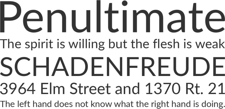
Follow a hierarchy of text styles
If you maintain a hierarchy of text styles, it will get simpler for you to repeat the pattern every time a new design is to be incorporated. Use H1 for the main headings, H2 for the sub-headings, and H3 for the less critical headings. Use a different style, like bold or italics, to highlight the links. Switch between P1 and P2 for the body text and other data which needs to be smaller. Developers use this hierarchy, and it makes it easier for users to identify the essential parts.
Use minimal fonts
Minimalism is the new trend on the web. Make sure that you incorporate it well in your UI designs. Use a maximum of two fonts, switching between the headings and body text. Keep consistency even in the variation. This creates a simplified view and helps the user to reach his destination data. Also, make sure to highlight the elements that must reach the user.
Understand the platform specifics
One same application needs to be curated differently for Android and iOS platforms. Depending on the system style, the design of the app will change. Factors like the style of the header, toggles, buttons, size of the elements, and so on will be affected. Therefore, you must understand the requirements of different OS platforms and design accordingly. Some basic differences are:
System fonts
Android – Roboto
iOS – SF Pro Text, SF Pro Display
Clickable area for icons
Android – 48×48 px
iOS – 44×44 px
Button height
Android – 48 px
iOS – 44 px
Maintain consistency in iconography
It is usual for a designer to take certain icons from the web and use them in the interface. Different sources can have separate sizes of icons. Feel free to customize them and pay attention to the basic details. With the same style and width of the icons, the display will be more user-friendly. The thickness of all the lines in the icons should be equal, to create a uniform overall look.
![]()
Design for accessibility
You have to maintain your edge above the other designers, and this can be easy if you stay concerned for the users. Remember that all your designs need to be accessible for the people, as it is for them only. The most common mistake that one can make is the lack of contrast between the text color and background color. A gradient or full image overlay can help you overcome this fault. Make your designs inclusive for all users, considering the color vision deficiencies too.
Alignment
As mentioned already, consistency is very necessary to maintain a neat UI graphic design. The same applies to the alignment as well. Make sure to keep all your text left-aligned only. Use center alignment only in exceptional cases where you need to highlight the headings and small subtexts.
Create a UI kit
At the end of every project, create a UI kit for the developers. List all the text elements, illustrations, icons, styles, and their usage in the design under different instances. This will act as a directory for the developers and saves them a lot of time. All the necessary details of the project remain included in the UI kit.

You must be logged in to post a comment.