


Setting up an online presence for your business is no child’s play. Several crucial factors are involved from choosing the right platform to custom development, themes and web designing. Websites designs are often the product of the business owner’s inspirations. It might have been that a particular object, occasion or time of your life that had a spurring effect on you, and now wish to add its essence in your online presence.
Similarly, giving a website its dress code through the right color combinations is also an effective way to send your message or brand goals towards the viewer. How elegantly you can do it, is what this article is all about.
Importance of Colors
Deciding which colors suit best for your website design is more than what meets the eye, because there is purpose and theory that fuels its application. A good color compounding not only shows that your website has outdone its competitors, but also reflects your sense of taste to the customer.
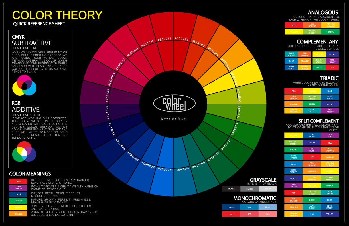
How to use Color Wheel to your Advantage
To start off you can use the color wheel to your advantage. It might sound a little trivial bit of detail, but the color wheel allows you to set distinction between primary, secondary and tertiary colors with their combinations within. On a single platform you can match the colors and select their hues for your color plan.
Example
- The primary colors include Red, Yellow and Blue which are most popular in the spectrum
- The secondary colors are the result mix of two primary colors which include, Orange, Green and Purple
- The tertiary colors are mix of primary and secondary colors and are composed of violet, Azure, Red-Orange, Chartreuse, Rose and Spring Green
Using Black and White
Its time you learn the power of black and white. Colors are not just confined to bright glowing glosses; they also include the dark black and pale white palettes. Many websites I have visited, especially ones that show HD photography use the black, white and neutral tints and shades. It is not suitable for all types of websites but one must always give it a try to see how it fits.
Example
A website that features HD photography on its pages avoids being mainstream and can post its pictures in warm and cool tones of black and white. This not only separates the subject from the image, but also gives an appealing touch to the website itself.

Adding Tints and Shades
Through my experience as a web designer, I have never seen a practice so underrated and underused than toning, tinting and shading of colors. Basically all you have to do is morph the color by adding white or black. Shading is color + black and tinting is color + white. Once you use them, you’ll really be surprised how much these can modify you color combinations
Example
If you are using red as your contrast, you always add waves of pink and purple in it. Since they are the tint and shade of red, it will go with the theme naturally. Similarly, your text can also exhibit the same quality, but it’s less likely to be as effective as the background.
Everything that Trends is not Gold
Another big mistake that many website owners make is copy the color combinations of top websites with disregard to their product type. Keeping up with the trends is not a bad thing, but using another theme color composition that is set for its own purpose to your use can be a disastrous move. Set your own palette to cover your product needs so it can withstand the rust that most websites get when trends change.
Example
If you are selling stereo system or speakers, you need to set the color themes according to the available colors your product has. This not only establishes a close bond with the website and content, but also allows the customer to choose according to their preferred colors.

Say No to Rainbows
As you are learning the tricks of trade for color disposal on your website design, there are some practices that you should never indulge into or are rather considered risky maneuvers in ecommerce.
Adding a whole mix of colors from yellow, red, green and purple, you will only lead your viewer into disorientation. The groupings of two or three colors speak louder than a dozen of rainbow spectrums all combined. The reason behind it is each color has its own room of effect that cannot be substituted with any other color.
Example
For instance red against a pale white background will bring the matters more conspicuously than 30 colors in each letter showing the company logo. Allow your colors to attend their specific roles by isolating them against the contrast, subtle yet striking.

Connecting Text Elements through Colors
Using the correct colors for text elements is the key behind perfect readability. Your viewer not only remains engaged if you have clear understandable text, but would be interested in trying your products from its appeal.
Building combination for text elements involve research, trials and your personal assessment. You will never compromise your choice on what others say that I know for sure. However, you may come to an agreement with the color you have in mind combined with the appropriate color the text heading, titles and symbols would go with.

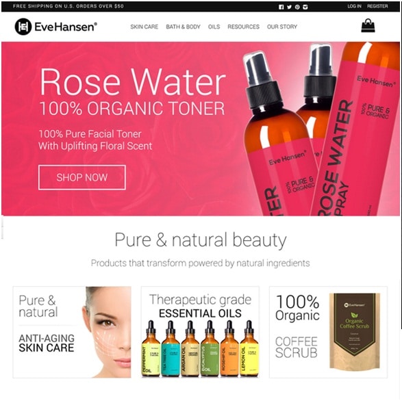
Content Friendly Colors
When we talk about making sound color combinations, it’s not only about seeking the right hue to hue color, but also the ones that keep up with the content you post on your website. For instance, an online clinic that sets appointments for doctors would go great with cloud white, light blue and lighter tints of green, but only an idiot would use bright red or black as combination theme colors.
Example
A website that sells skincare products would go with pink or sandy colors instead of darker shades. Customers have an instinct for picking out a flawed combination and you don’t want that to happen for your store.

Make a Color Plan
After making a code of colors that you will use for your website distinctively, apply them in the process and make sure each of them have a consistent presence within the theme. Create a plan for your color sheet.
Here is what needs to done for you color sheet:
- Choose the list of colors you will designate for you website
- Pick tints and shades of your selected colors if they do not mix well
- Use hit and trial to see which colored test goes best with the contrast
- Analyze if all the elements of your website need of color or not
Conclusion
For the final note, let me leave a piece of advice. Never overdo your website with colors. It simply does not appeal the user. The smartest thing you can do is keep the colors on the minimum, but use them effectively on places that matter. For starters, your combination should not include more than 3 arc colors, because simplicity is what counts when customers come across a new website.
Author Bio:
This contribution is made by Simon Walker. He is a professional eCommerce expert currently working for FmeExtensions, a company known for its Magento extensions and Ecommerce website design services.

You must be logged in to post a comment.